What is Light Mode in Visual Design?
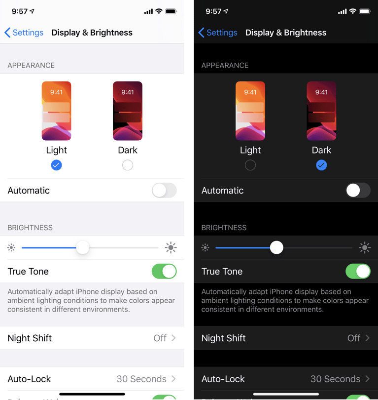
After discussing dark mode in the previous article, the next UI topic is the light mode. The light mode does not necessarily mean a bright background. It means using a lighter background for the interface of visual design.
Although different from dark mode, it offers similar benefits. For people with specific visual impairments, it helps using a lighter background. A lighter interface comes as an advantage for products.
The text has to be clear, concise, and legible. Depending on the brand’s color scheme and target audience, a light background can be beneficial.
All Stages Of Product Development
Raluca Budiu
Light mode is suitable for all stages of product development. New products are in the working stages before launching. Product managers are looking to design the best interface for a great user experience. This means the right color scheme and components.
Mature products may see issues from the design as well; some users may complain about eye strain in product reviews. As always, product managers are looking for ways to retain existing users.
Mature products are using the right amount of light. The product is working for users. The only thing is to double-check all design areas. Notably, the areas that can be a potential threat to a negative review should be looked at. These can be areas on an interface that may be hard to read.
Read more about how you can use other UX strategies to grow your company revenue.
The Perks For Using Light Mode
Rhiana Heath
Using light mode can have its perks. Users are looking for things to read and buy on an easy platform. The first thing they look at is the overall appearance.
According to the SoDA Report, 77% of agencies believe a terrible UX is a weakness to their clients. That is true for many users. If it’s not accessible, it’s considered a defect. If the text is not legible or causes eye strain, it’s a disadvantage. Light mode fixes these problems.
The top reasons for using light mode are:
- Suitable for reading long text
- Reduces eye strain
- Improves concentration with white space
Suitable For Reading Long Text
Buster Hien
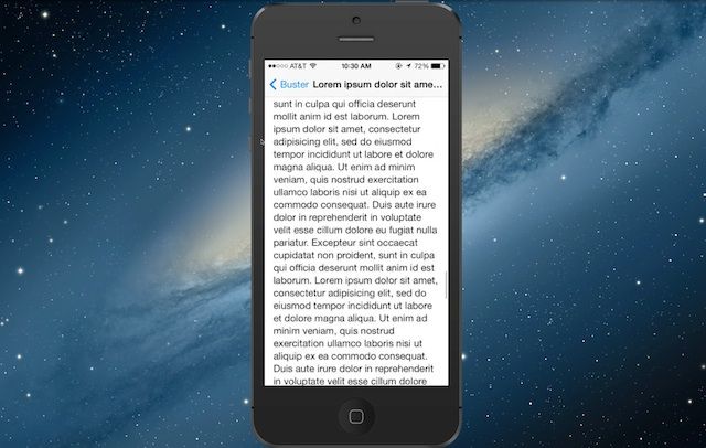
The best thing about the light mode is for text. For pages with lengthy text, it makes it easier to read. Using a light interface improves concentration.
White space around text improves focus by 20%, according to Dmitry Fadeyev. For extensive blogs or paragraphs, using light mode will help.
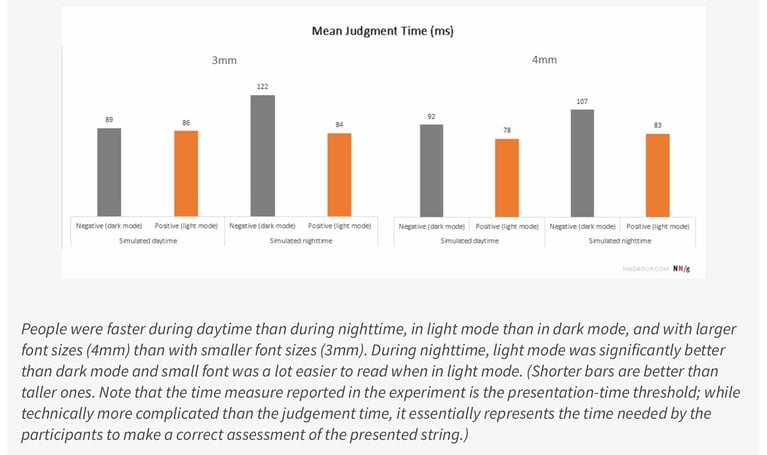
Jonathon Dobres and his colleagues did a study. It was to see whether the time of day and screen lighting affects judgment time. The results showed that lighting, time of day, and text size are three main factors.
Users using a light screen experienced quicker judgment time. Also, daytime use and larger font lead to faster judgment time as well. For daytime use, it took users 78 ms to form a perception on a 4mm font. For darker backgrounds, it took 92 seconds.
Raluca Budiu
For nighttime use, lighter interfaces show significant differences from darker ones. Light user interfaces manifested a faster judgment time and also helped with a reduction in eye strain.
New products can present their message and persuasive value proposition without issues. A vast amount of text can pose a challenge to achieve optimum visual hierarchy for any product. Mature products have a real opportunity to improve the user interface that has a considerable amount of text. Those, as mentioned earlier, will cut back on negative reviews.
Reduces Eye Strain

Pete Woodhouse
Whereas dark mode has to increase the opacity for text, the light mode does the opposite. It reduces the opacity to 56 percent. That reduces eye strain.
People with specific impairments may have issues with bright light. That makes it difficult for them to read. There needs to be a balance in color to make it accessible.
New products can test this with usability testing. Product managers can gather feedback to see if it works. It will help product development and making sure the text is legible. Stagnant products may be using bright opacity with text. Reducing this will cut back on problems with reading and comprehension. Mature products can improve their performance better by adjusting all text to 56% opacity.
Improves Concentration With White Space
Nicole Cozma
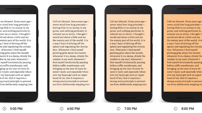
As mentioned in a previous blog (link), white space improves concentration. It enhances focus and separates everything individually. That makes digesting information much more effortless.
Using it around text improves focus by 20%, according to Dmitry Fadeyev. Users can find things easily on an interface. It makes the visual design more organized.
New products can improve concentration on prototypes and high-fidelity wireframes. You can test the outcome in usability testing. Collaboration between team members will be more comfortable. Stagnant products can make the right adjustments to the background to improve user experience. Mature products can improve focus better with corrections.
Employees Want An UI That's Easy To Read

Shutterstock
Employees have to be able to understand a product before using it. That means they should be able to read it. The information should be clear and visible. The employees are working with customers have a direct impact on the revenue. User friendly in this context does not only mean ease in navigation but accessibility for eyesight.
Using light mode will solve these problems. Ensuring reduction in the opacity of text helps with eye strain. Increased use of white space will also improve the focus. Navigation will be less of a hassle. Customer experience will increase as a result of improving employee performance.
Team members can collaborate more comfortably with light mode. Communicating with stakeholders will be more comfortable. For everyone to be on the same page, the product should be legible. Cut back on things that cause headaches and eye strain.
Read more about the differences between User Interface vs. User Experience.
Light Mode Can Affect Budgets

Shutterstock
The light mode doesn’t cost anything, and any UX Tool can help implement it. But can it affect a business's budget if not used right? The answer is yes.
Product managers that avoid using light mode can impact their results. Customer and user experience can be affected. 64% of users stop, switch, or use a product less after one bad experience. That is according to Ipsos and Medallia’s study. Not using light mode can cause a bad user experience.
The light mode can make the text more legible. It makes everything easier to find. It cuts back on issues with eye strain. Accessibility plays into the user experience. If users can not use the app, they will leave to the competition. The right design agency can help you. Read more about Choosing the Right B2B Mobile App UX Design Company.
Conclusion
Choosing between light mode and dark mode for a company’s product experience can be very challenging. We can help. For further information, you can contact Designial for application design using a fixed-price. Contact us to get started.