UX Design
Does Dark Mode Improve The User Experience?
Dark mode saves battery life, makes product accessible and improves customer experience. Apple, Google apps support dark mode. Do your apps?
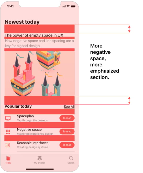
One thing that makes good visual design is using white space. White space is the negative space between objects. It separates all objects in a UI from each other to prevent them from crowding.
White space is essential for product layout but to improve concentration. It uses different strategies. Several strategies are:
 Viktorija Bachvarova
UI Design focuses on the look part of the user experience design. Product UI designers have to make certain UI elements clear and concise, so they have to space everything out. This way, users can quickly process each component and or group of elements and their purpose on the screen.
For new products, providing ease in decision-making and concentration are both critical for end-users and team members. Product managers want clear and concise visual design. They want to maximize automated processing.
They’re asking themselves:
 Nick Babich
For mature products, sometimes retaining existing users is a big challenge. Not minimizing options on the UI can increase the cognitive load.
Product managers at this stage are looking to attract new users but also win lost customers back. They want to decide:
As for mature products in the growth stage, white space can substantially impact user engagement. In this stage, the standard, expected measures are growth in app installment rates, user sign-ups, etc. Experimentation based on continuous user research and testing results can uncover growth opportunities. How you solution for those business problems directly impacts the growth. Existing users are grown accustomed to familiar user experience decluttered UI and so do the new users, so the benefits are clear.
 App Samurai
There are many benefits to using white space. The main benefits are:
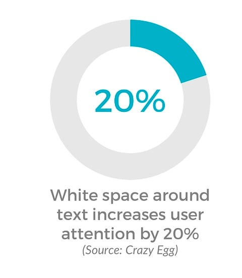
White space increases concentration. According to a study, white space increases user attention by 20%.
Improving concentration makes decision-making for consumers easier. Users can identify essential parts of a design. As a result, they can read text easily from start to finish.
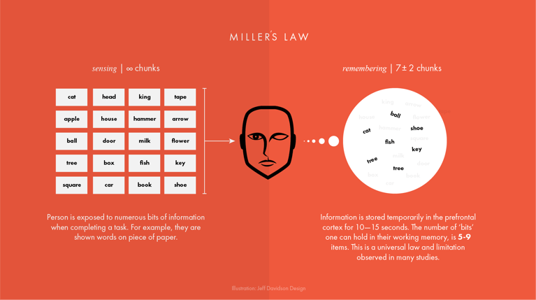
It also minimizes choices. For example, Hick’s Law state’s that fewer choices lead to faster decision-making. Decluttering a messy interface can bring out the value of the visual design.
 Jeff Davidson Design
White space plays an essential role in all stages of product lifestyle. New products can use the strategy to attract new users, stagnant products can improve user experience to retain existing users, and mature products can continue to maximize their strengths to grow further.
 Icons8 Blog
Visual Hierarchy is how people can tell the level of importance of elements in visual design. People rank objects based on size, color, or shape.
White space makes visual hierarchy easier to achieve. Users should be able to identify what parts of a product are more important than others. Sizes, shapes, and colors should be noticeable with the appropriate spacing.
 Koyes Ahmed
White space will help arrange the structure and layout of a UI. It will space all objects out where users can see the information clearly and process it quickly.
New and stagnant products can benefit from this. New products can design suitable objects during the building stage with appropriate white space, and stagnant products can correct or adjust UI to show the visual hierarchy to address user retention problems.
 Shutterstock
The right amount of white space can help usability testing in the long run. For new products that are in the development process, usability testing ensures everything is on track. It makes sure errors are not present before building the final prototype.
Products at this phase have set up wireframes to develop a prototype. Product managers are setting up usability testing sessions to test prototypes.
When testing a wireframe or prototype for a user, white space determines its results. Elements from the UI should be balanced, demonstrate a level of simplicity, and separated at equal distance.
 JustInMind
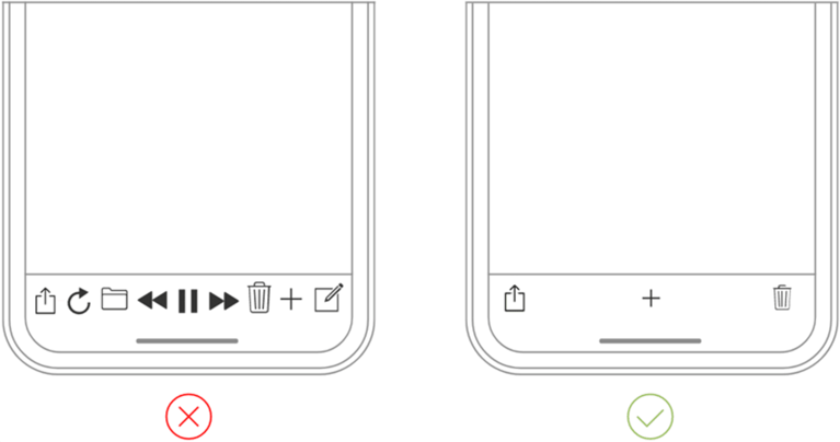
Products that do not have enough white space, elements crowding, and clutter in the UI will:
On the other hand, products that use the right amount of spacing will have a better ROI. It will showcase the core value of the product and its features.
With interface design, team members and stakeholders can find benefits with spacing. All members are collaborating and working together. They’re working through stages to get to the final product before launch.
During product development, developers and UX researchers are needing to collaborate with stakeholders.
A messy and cluttered UI will not help. It makes it difficult to follow the layout and focus on the product's value. As a result, the stakeholders will not get the right message.
The proper spacing will help employees and stakeholders stay on the same page. Adverse outcomes will decline. Above all, it will avoid having to go back to the drawing board.
For employee products, spacing is crucial for understanding product structure and navigation. Fewer mistakes will occur. Decluttered user interface will achieve a better employee experience.
 Shutterstock
Although white space doesn't cost anything, it can come at a cost if avoided. A product that’s launched into the market not using the right amount of white space can affect performance.
Using less white space, customers will find trouble following a path or completing an action. Users will more than likely leave and switch to another app. Negative reviews could increase. All of this will generate less profit from consumer spending. It will cost a business more money, resulting in having to re-design.
Using too much white space can have a negative impact as well. Not using enough content can make an interface design appear dull and not fulfilling. It can have the same adverse effects as having too little.
There should be a balance between the two for better ROI. Cost will be cut back significantly. Positive feedback and more straightforward navigation will show.
Product managers are always looking for ways to attract new users, retain existing users, and new growth channels. Proper UX design solutions can help achieve those goals. It can also lead to more sales. To improve your UX design for your mobile app or mobile-first site, designial can help. Talk to us.
Dark mode saves battery life, makes product accessible and improves customer experience. Apple, Google apps support dark mode. Do your apps?
Light mode is good improves focus by 20%. Google offers apps in both modes. Find out which one is right for your app. Talk to designial.
Secret to Apple's scussess is Hick's Law. Minimize options = faster decision making = best UX. Designial can help your complex product.