Legibility and Clear Is The New Trend
By looking at visual design patterns, dark mode at some point will show up. It’s a trend that is used by many apps. One may ask, what is the dark mode?
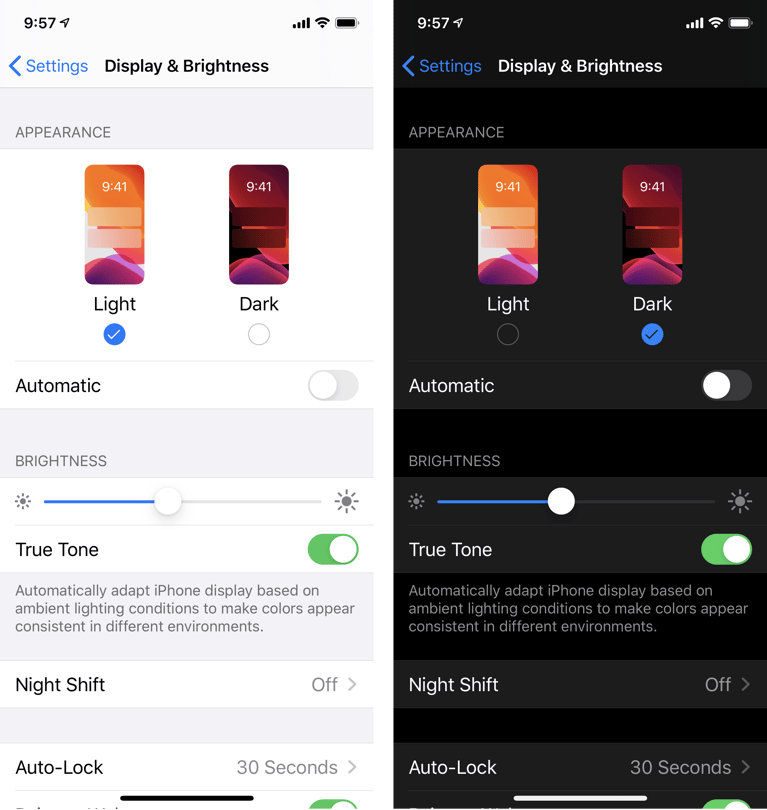
The dark mode is using a darker background shade for visual design. The User Interface (UI) uses white text to make the copy legible. The text opacity is higher.
Read about the difference between UI and UX in our previous article.
The dark mode is famous for many apps with younger users. Many brands and businesses take advantage of using dark mode because of the advantages it provides. The benefits are listed below.
Essential To All Stages Of Product Development

Raluca Budiu
All stages of product development can benefit from using those, as mentioned earlier. For new products, product managers are looking for ways to improve user adoption of their product, including users with accessibility needs. They can attract a group of users who prefer dark mode over the light mode. They are also looking at long term effects. For instance, what will save battery life?
Mature products have an ongoing challenge for user retention. If users find competing product that supports the dark mode, they may switch to the competition. Many users leave mature products because of battery draining issues; having a dark mode option can help retain those users. Product managers are always trying to win back customers. Mature products, often stuck, in a phase where the product produces smaller ROI; we call this state called the dormant stage.
For mature products, they are showing steady engagement. Consumer spending is exhibiting an even flow, but it doesn't show growth. They may be using light mode for the interface or existing patterns. Product managers at this point are thinking:
- Will dark mode help the business succeed?
- Are the chances of using dark mode going to hurt the steady progress?
- Is dark mode worth it?
The Perks For Using Dark Mode
Just like light mode, the dark mode has its perks as well. The product stands apart from the competitors and improves overall product performance.
Top Perks For Dark Mode Are:
- It saves battery life.
- Prevents blue emitted light from using the screen.
- Great for night usage.
- Gain customers with visual impairments.
Saves Battery Life

Chris Welch
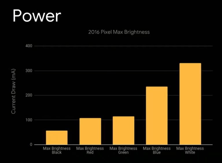
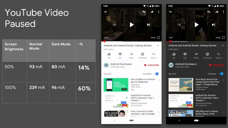
The disadvantage of light mode is that it drains the battery. Dark mode can come in handy for this. Saving battery life extends the time for engagement. This can be for work, entertainment, or exploring the app's features.
Products using this will see better reviews about longer stamina. Retention can improve better than before. Longer activity time means a possible increase in consumer spending. It depends on what stage the product is in.

Chris Welch
New products can use dark mode for usability testing. Testing the visual design on users can help. It can help determine how battery life affects performance. UX research can be gathered based on user emotion. It will improve collaboration between designers and stakeholders.
Dormant products can use the dark mode for UX research, For example, an A / B test. One can compare their previous design with the new one. Product managers can decide whether dark mode improves user experience.
More than likely, it will cut back on negative reviews about battery life and improve retention.
Mature products can save more battery life. Cutting back on bright components can improve the visual design. Steady progress will continue.
Prevents Blue Emitted Light
When a background is bright, a blue light appears. The blue light can cause some damage to the eyes. It affects people with visual impairments that are sensitive to light.
With using dark mode, it decreases the light exposure. Users can interact with designs easier—less light results in less strain on reading.
New products can improve using a darker background. It can be implemented to prevent eye strain for usability testing. Stagnant products will see better results by making adjustments to existing features. For instance, features that are too bright. Removing anything too bright on the screen from products that are succeeding can help as well.
Great For Night Usage
The same benefits of reducing blue light are the same here. For using devices at night, it should ease your eyes. Dark mode cuts back on bright blue light coming from the screen.
Using apps at night will be more comfortable. Eye strain will decrease for some users. Information will also be easier to digest. That is because using a darker background can reduce brightness from a light interface. For some users, they find that darker backgrounds are suitable for their eyesight.
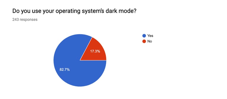
Thomas Steiner created a developer survey design on google forms. The purpose was to gather data on users who interact with dark interfaces. The survey consisted of 243 participants. Out of 243 participants, 82.7% admitted to operating the system’s dark interface tool. Only 17.3% said no.

Thomas Stein
As for the reasoning, 150 out of approximately 201 participants said it’s easier for the eyes. It ranked as the highest out of all the reasons listed. Although studies claim dark mode isn’t as helpful as lighter interfaces, it’s still accessible.

Thomas Stein
Using apps at night will be more comfortable. Eye strain will decrease for some users. Information will also be easier to digest. That is because using a darker background can reduce brightness from a light interface. For some users, they find that darker backgrounds are suitable for their eyesight.
Products in all stages need to be usable during night time usage for a better user experience and users' health and safety.
Read more about other product experience design strategies in our previous article.
Employees Enjoy The Dark Side
For employee-facing products, dark mode is useful. It can help employees with visual impairments. For anyone with sensitive eyes, it prevents blue light from the screen. Product managers are always looking for forthcoming trends to surpass the competitors. The dark mode is that new trend that will help the product stand out.
For employees that have to work long hours, using a darker interface is excellent for night usage. Less brightness appears from the screen. They can quickly locate elements without issues. When users find what they are looking for relatively quickly, the result is a better customer experience.
Does Dark Mode Come At A Cost?
Using dark mode itself won’t cost anything. One can easily use a dark background for their projects. UX tools offer different color schemes.
As for product managers that avoid it, it can come at a cost. It’s best to offer dark mode, even as an option, for users. Taking into account accessibility is a prime reason for using it.
Without dark mode, it can affect customer and user experience. Reviews, retention, engagement, and onboarding are examples. Contact us if you need help implementing dark mode for your products.