Hick’s Law: Reducing Choices For Interface Design
Secret to Apple's scussess is Hick's Law. Minimize options = faster decision making = best UX. Designial can help your complex product.
With technology advancing, trends are emerging. As a result, UI has improved. There are many more new features and tools than there were ten years earlier.
Customers' expectations are rising. Therefore, more demand for certain features is increasing. With different resolution sizes and technology improving, it's opening up many doors.
Traditional forms of advertising and being swayed by a product's price isn’t enough anymore. Customer Experience and User Experience are more difficult to achieve now. It’s about having a good UI. Following the proper steps to provide better touchpoints is critical.
What is the difference between UX and UI? Read more about it in our previous article- User Experience vs User Interface Design- Understand the Difference
With consumers having a significant influence on products, trends are forming. Users expect products to adapt to consumer behavior, which translates into trends. That is especially the case for GenZ and Millennials.
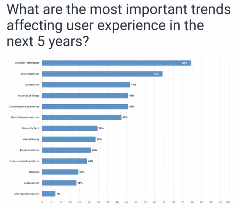 The State Of UX Enterprise
New products can benefit from following suitable patterns. According to Jakob’s Law, users prefer to use other products. That means they expect your product to work the same way as competitors. Providing the same ease of use, if not better.
 Andy Sowards
The purpose of Jakob’s Law is to create a friendly approach. Following UI patterns ensure better ROI. At the same time, it also helps the cognitive load. End users expect products to adopt similar practices—designs advertised from other products such as placement, navigation, and features.
For new products, design and layout are essential. Product managers at this point have collected data from UX research. The UI is in the early stages of product development. They are now thinking of ideas for wireframes and what features to use for the UI.
 Andrew Kucheriavy
Mature products can benefit as well. For products seeing a halt in growth, product managers should look back at the layout. Lack of specific features can be the reason for lower rates of growth. It can also be the reason for the lower rates of consumer spending and app installments.
The questions product managers are asking:
 Vincent Xia
Using visual design trends will increase consumer spending. It will also improve the chances for a better customer and user experience. UI / UX needs to work together for visual design to work. An app should look visually pleasing. At the same time, it needs to be accessible and functional for end-users.
Learn more about visual design- Visual Design: Everything You Need to Know to Increase Product Sales
Any pattern that: supports accessibility helps users get to their destination the fastest and provides relevance to the page will help.
The top UI trends as of 2020 are:
 Teresa Villegas
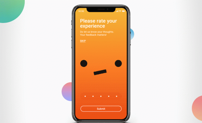
Animated illustrations are good for bringing the product to life. It adds personality to the UI. That makes the design more engaging.
The first thing to do is to use energetic visuals that stimulate a positive emotion. Make sure the color scheme is balanced and matches the theme. The second thing is to use UX tools for animation. Several UX tools mentioned from previous blogs are:
For new products, animated illustrations will improve engagement, which leads to positive reviews. It ensures performance will start strong when launching into the market. Stagnant products can edit existing visuals that lack this feature. Better ROI will happen as a result. ROI such as
 Vamsi Batchu
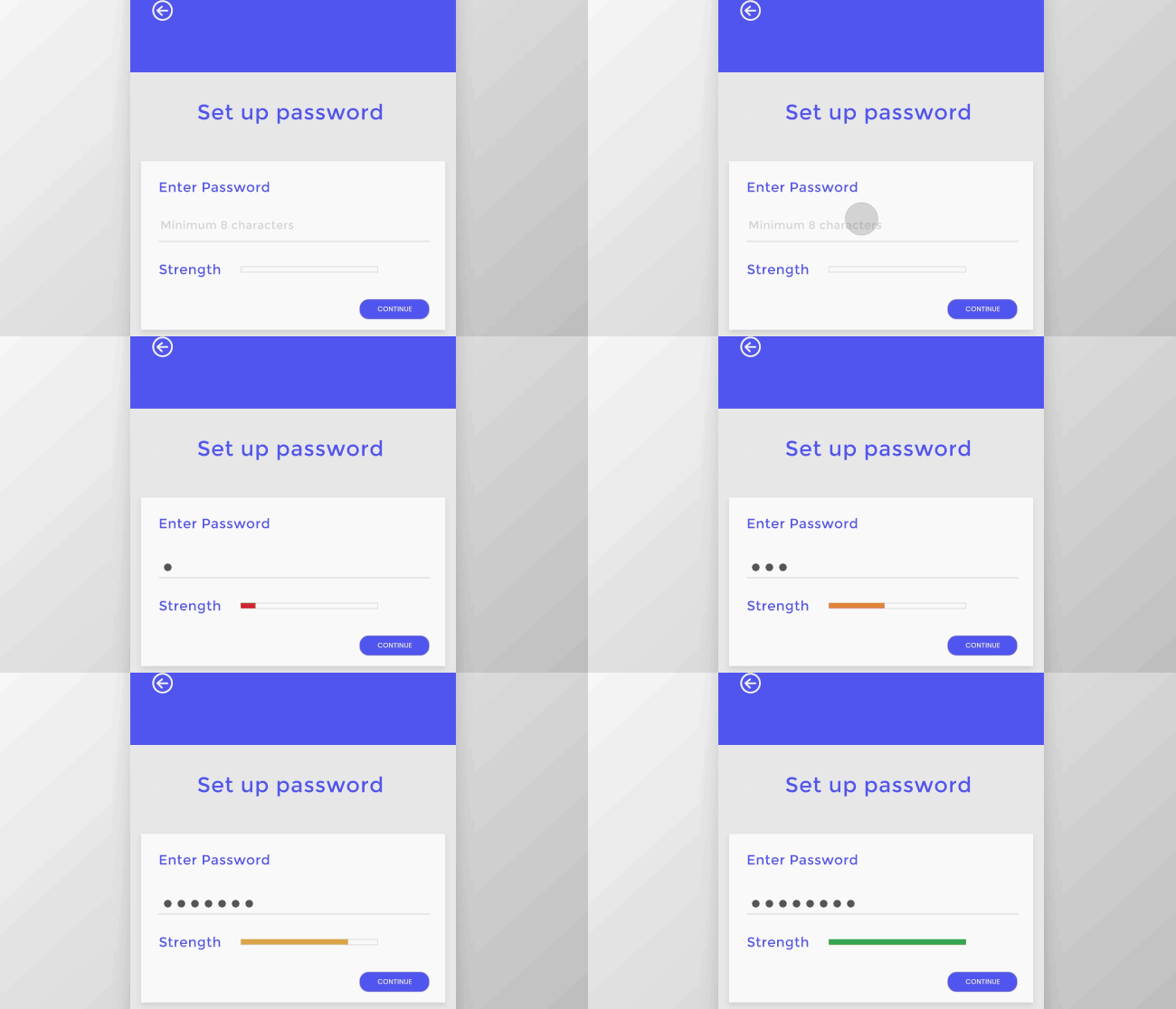
Microinteractions are visual feedback shown on the screen. It’s triggered either through the system or from the user. It offers users what happens as a result of clicking or touching something. The little things a user sees hears, or feels are considered a micro-interaction.
Several examples of micro-interactions are:
Whenever a user interacts with or clicks on a component, they will trigger a micro-interaction. As for system initiating triggers, when specific requirements are met, it will trigger a micro-interaction. For example, using voice command.
 Vamsi Batchu
Benefits from using micro-interactions are that:
New products can stand out with the right micro-interactions. It can communicate the brand that stands out from competitors. In addition, it adds personality to the visual design. New forms of micro-interactions are coming up every day. New products can use a variety of them to be creative.
It makes it clear to users about the status of the system by showing what’s happening. That decreases the chances of poor reviews. In addition, it eases users from confusion.
 Vamsi Batchu
Mature products could be using the wrong micro-interactions, leading to poor user engagement. Users will have a better user experience with the right micro-interactions.
That is no one's fault. It just means existing micro-interactions may not fit with the visual design. A simple adjustment will improve conversions in the long run.
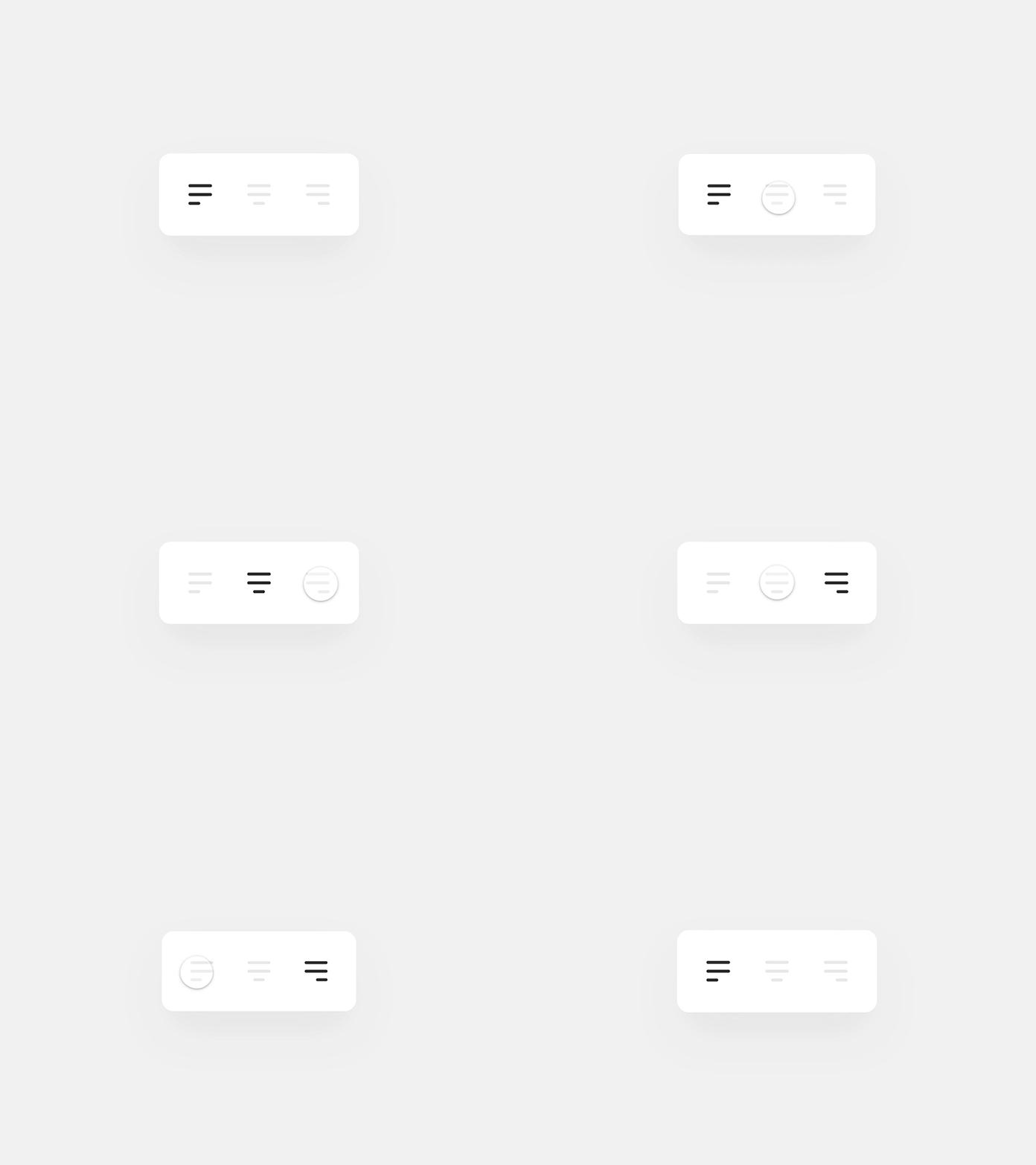
Asymmetrical layout is a trend that adds personality to a design. With it being 2020, traditional templates are gradually fading. Visual design is becoming more creative with the layout. Users are expecting a unique experience.
There are endless opportunities to use asymmetrical layouts. It gives users more control and freedom with UI elements. The UI elements can be placed in many positions. As a result, it gives brands a new way of showcasing their content.
New products can take their content and uniquely arrange them. Keeping certain elements locked in certain positions, product managers have endless ways to design. UX designers can arrange the content in ways users can easily read and access. This has a great chance of being beneficial.
Stagnant products can edit existing layouts. Product managers may be seeing low ROI because of not using current trends. It may be following old ways of showcasing content that appear to be boring. For example, using plain templates.
Try using a different approach. That will improve many things. Communicating brands is just one example.
 Vilem Ries
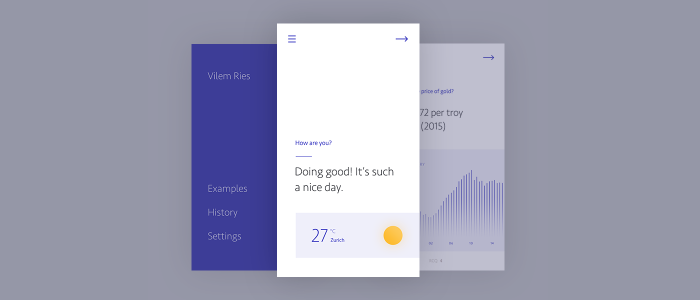
As mentioned before, minimalist themes can help minimize choices. That is a trend that is popular as of 2020. It cuts back on complex design and information overload. Also, it takes advantage of simplicity.
Minimalist themes induce more emotion compared to other approaches. That is because it’s clear and legible. For example, users find text with too much personality-less pleasing. They want simple and big text.
It uses enough white space to separate everything. That improves attention and focus. Studies have found that white space can enhance engagement by 20% more.
Learn more about the importance of white space in our previous article- How Can White Space Enhance The Product User Experience?
 Jakub Antalik
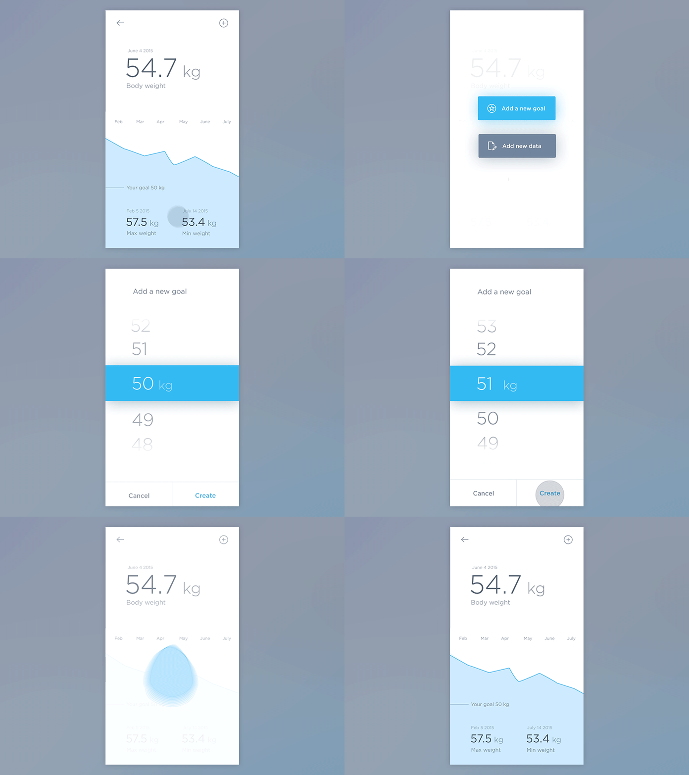
New products that use this theme can boost concentration. It will take less time to make decisions. Users will save time and find it easy to read and navigate the UI.
Stagnant products should look back on the existing layout. Things can be at a halt because of the design temporarily not connecting with end-users. If any of these factors occur, it should be edited:
 Smashing magazine
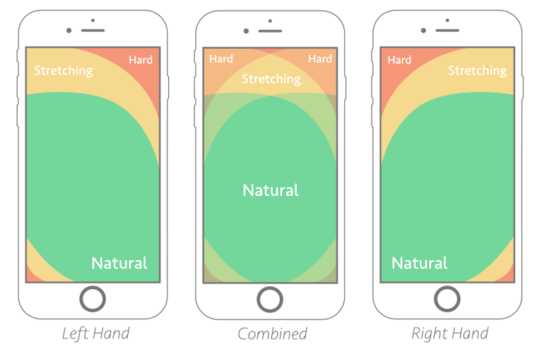
With the mobile design, one trend staying strong is placing the most used actions at the bottom. One may ask why? As desktop sites are putting the most important tasks at the top, mobile does the opposite.
That is because of research studies about mobile devices. Phone sizes have increased from 3.2 to almost 6 inches over time. That has been happening for over ten years.
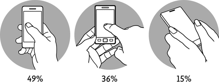
With devices getting more prominent, there are different ways of holding a phone. There are three leading positions. According to Steven Hoober and Josh Clark, the three main patterns for holding a device are:
 Dreamer UX
With all the positions combined, 75% of users use only one thumb. There are different touch zones on a mobile screen. Frequently used actions are recommended to be placed at the bottom.
For both new and stagnant products, this is important. Better engagement, user experience, and access to actions will happen. It will be accessible and easy to locate. There will be higher chances for a new product to mature. Stagnant products will see a cutback on negative reviews and more interaction.
Why do UX trends matter? Learn more about how they are linked with digitization trends and how they can help your business.
 Shutterstock
For designers and developers, the following patterns can help employee-facing products. It will also assist employees who are working with customers.
Using a minimalistic theme will make things easier for employees to understand. The right micro-interactions help employees understand what’s going on with the system status. An example is showing employees when a page transfers to another page.
Using asymmetrical patterns and placement of actions will help locate things easier. Employees will have fewer problems interacting with the product. As a result, morale will improve.
 Shutterstock
There’s no significant budget required for following these trends. Keeping up with the latest trends pays for itself without having to spend significant amounts of money.
Not following the latest design patterns can cost a business. It can cost time and money in the long run. Things that will be affected are consumer spending and rates of retention.
Reduce the chances of losing time and money by researching patterns. Product managers will see a great return by improving the customer and user experience. Customer acquisition costs will decline.
Embrace trends and patterns. Using UX before development takes place will help. It cuts back product development by 33-50%. This is according to Interaction Design.
Choosing the right design patterns will avoid costly redesign. As a result, users will be satisfied. The only thing users don’t want is to be confused. Conversions will happen when things pick up.
Learn more about UX strategies that are right for your product and business- How To Leverage Proven UX Strategy To Grow Your Company Revenue
It’s essential to provide the best products and services for user experience to compete with industry leaders and upstarts today. With the availability of excellent UX tools such as Adobe XD, Sketch, Figma, etc., there is no excuse not to adopt the latest UX trends to catapult your business ahead of the competition. Does your internal UX team or an external vendor have the expertise to transform your business digitally? We can help; talk to us.
Secret to Apple's scussess is Hick's Law. Minimize options = faster decision making = best UX. Designial can help your complex product.
There are purposes for using wireframes. It helps communication and improve agile UX amongst team members. Product managers will save money and time.
Visual design is crucial to ensure product exceeds user expectations. It will affect product growth and consumer spending. Talk to designial.