
Hick’s Law: Reducing Choices For Interface Design

January 12, 2025
Understanding Hick Law Simplify for a Better User Experience

Cutting Back On Options For Faster Decision Making
People on the go and have limited time want a product that’s easy to use. Consumers want a UI that’s simple and provides a good user experience. The number of features and the ease of navigation is critical.
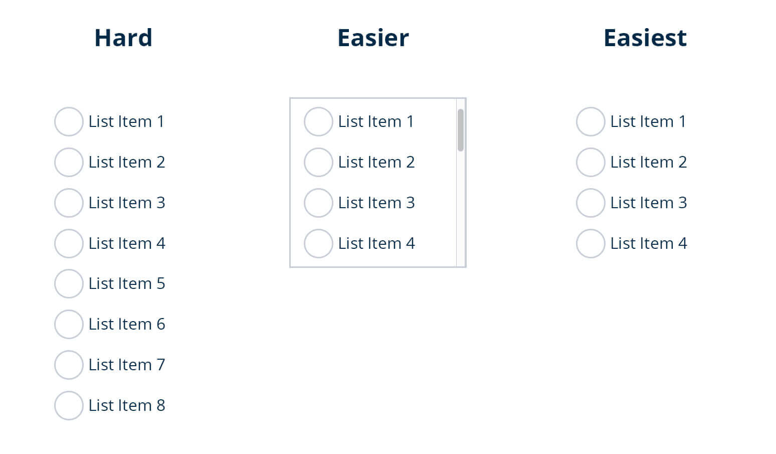
The best way to increase product engagement is to eliminate unnecessary items. According to Hick’s Law, a person’s ability to decide depends on the number of options provided.
Learn more-
User Experience vs User Interface & Understand the Difference
User Experience Trends You Need To Know To Advance Digital Transformation

Krisztina Szerovay
For new product managers, offering unlimited options may initially seem the best way to seek a higher ROI. However, that is not the case. The more options a user is presented with, the longer it takes them to decide.
Hick’s law focuses on minimizing choices to reduce the clutter that, in turn, improves the user experience. The purpose of Hick’s law is to reduce the complexity of making decisions. Complexity is reduced by simplifying the decision-making process.
Cutting back on options will lead to faster decisions by users. Users enjoy products that save time and get the job done. That is a fundamental principle for UX.
Learn more-
Does Light Mode Actually Improve Readability and Reduce Eye Strain?
Improving ROI with Proper UX Strategy
All Stages in Product Development Are Affected
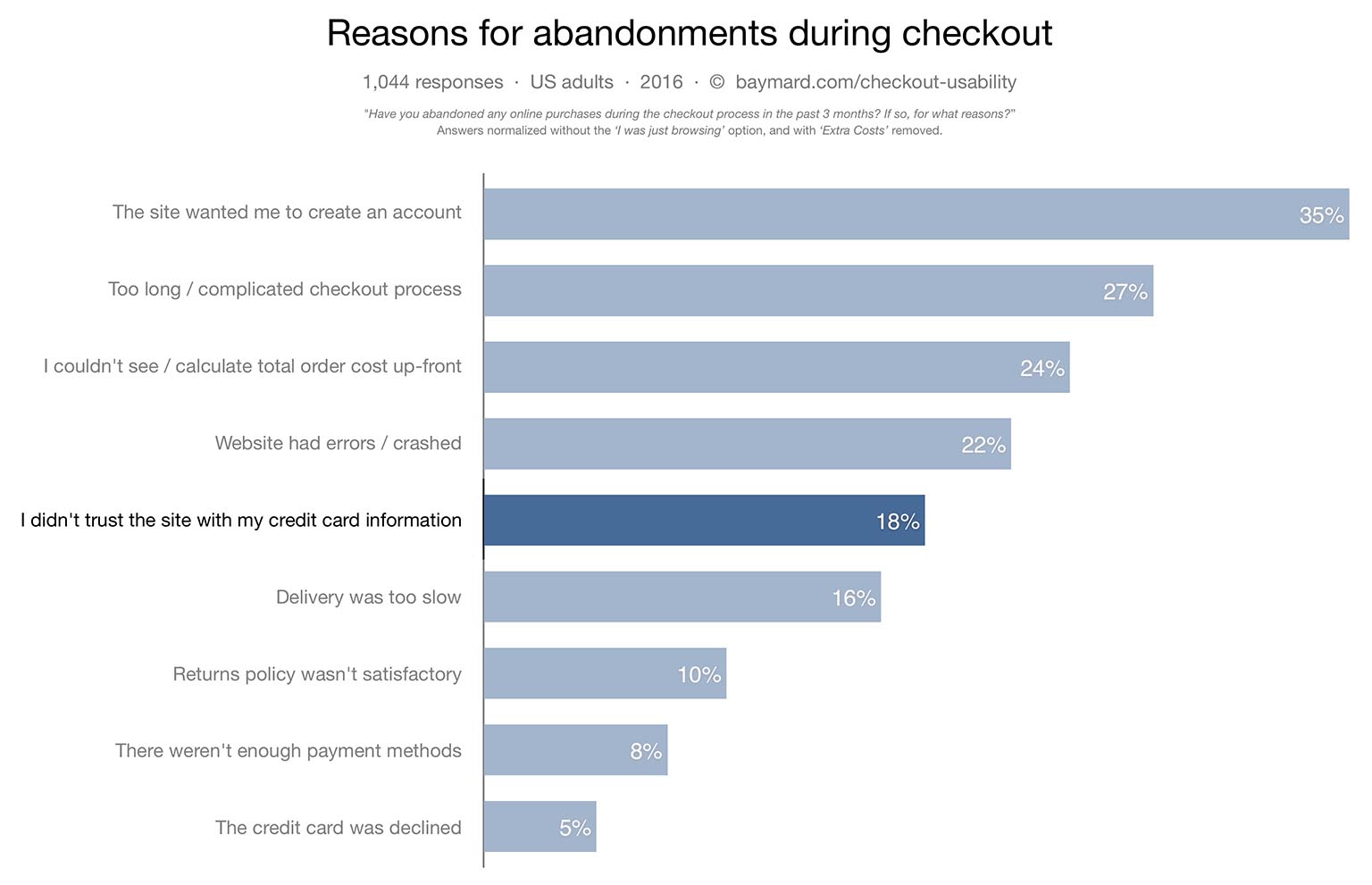
Baymard Institute
Minimizing choices is vital in all stages of development. The goal is to create a layout that ensures ease and demonstrates simplicity.
Prevent New Products From Falling Flat
Product managers at this stage should look at two things:
- What layout will show the product’s core value?
- What will reduce the chances of opting out?
Products with too many choices not only stress the brain. It also affects the UI of becoming a mature product.
Learn more-
How Buyer’s Journey Helps You Boost Revenue At Every Product Stage
How Can White Space Enhance The Product User Experience?
Adjusting Mature Products
Products are seeing poor reviews. Users leave negative review comments if your product’s design solution is too complex for them to understand. Consumer spending is being affected, and the product struggles to retain users and their spending.
Product managers are looking to get back existing customers. We call this a dormant stage. They are looking for ways to increase retention and improve the customer experience.
Read our success story- Reduced time on task from several hours to minutes
Keep Progress Going For Mature Products
Mature products, at this point, should have limited choices. As a result, it’s showing steady progress. The visual design uses a suitable format. Maintaining this progress is what should be done. Preventing drastic design or adding additional options is critical.
Learn more- Never Stop Improving the Product UX- How to Leverage AI Technologies
Top Ways For Minimizing Choices For UI

Anton Nikolov
Minimizing may not seem as helpful to some people at first. It’s tempting to offer customers a range of options to satisfy them. You want users to feel they have options.
Minimizing choices to the essentials can help in the long run. Better product performance will happen. A better user experience will result. Users will have less stress navigating or deciding what options to choose.
The top benefits of minimizing choices are:
- Minimalism
- Cut back on negative reviews
- Product development
Following A Minimalist Theme
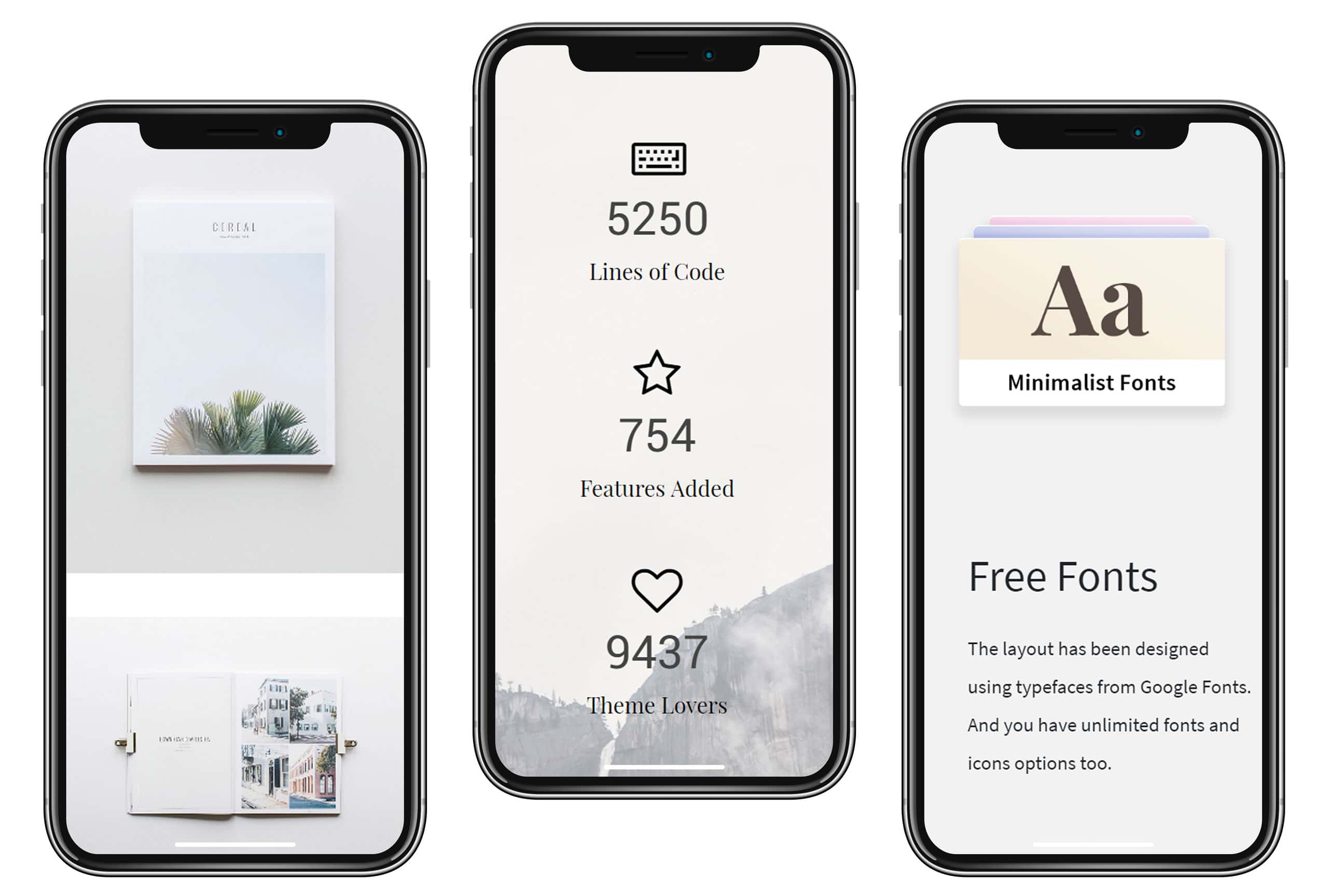
Visualmodo
One of the top trending UI patterns for apps is minimalist design. Many of you may have heard the term. It builds on the importance of simplicity, clarity, and legibility.
All features should demonstrate a level of ease and use. Endless options should not be of significant importance to this theme.
Minimalists use enough white space to increase focus. It reduces the complexity of having too many decisions. In addition, it also reduces the use of unfamiliar elements and limits the UI colors to three.
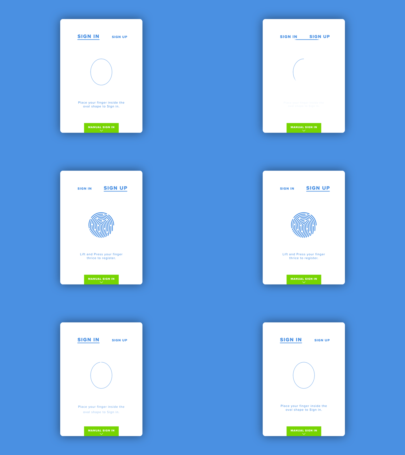
Mockingbot
According to Ismail Benmbarek, typography and objects with too much personality induce less emotion. Users want text and UI elements that are big and simple.
Studies have found that simple and big have induced more emotion. That is because minimizing is what helps users get more involved. New and mature products should benefit from using these tips.
The UX can quickly promote its core value so product managers can focus on advertising its essential features. In contrast, mature products can focus on maintaining a competitive edge over the competition. In addition, proper use of white space will help the product to find its way to success.
Cut Back On Negative Feedback
According to Ipsos and Medallia’s study on customer experience, personal experience with visual design impacts a brand.
Learn more about visual design in our article- Visual Design: Everything You Need to Know to Increase Product Sales
Based on the data from the studies, about 50% of users look at the personal experience as the main reason for choosing a product, and 20% of users prefer a product based on the recommendations from others, so customer feedback.
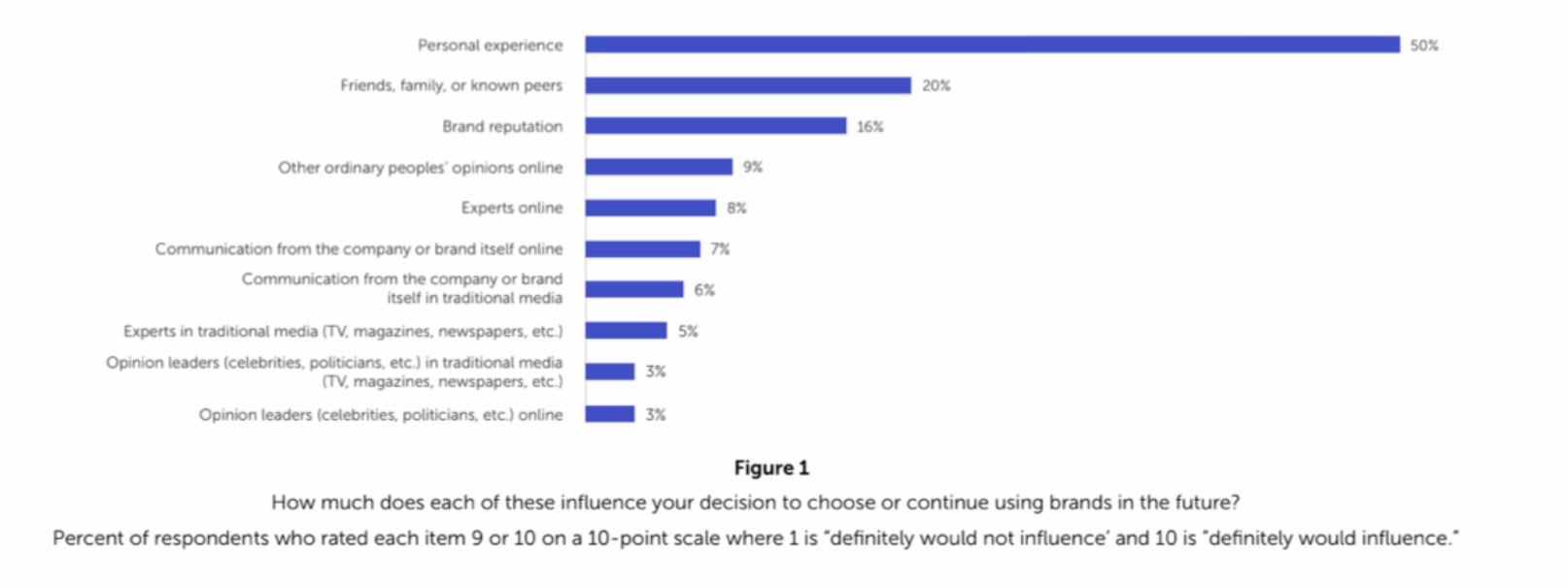
Medallia and Ipsos
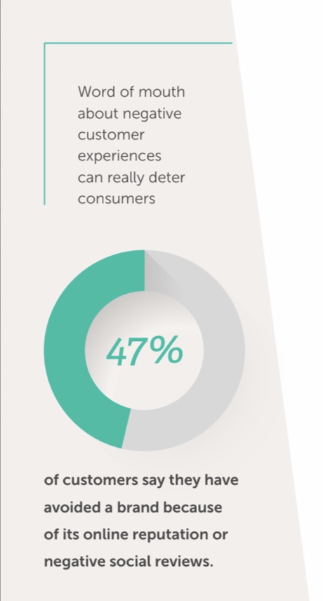
That may seem like a low percentage. However, further in the study, 47% of users abandon a brand because of negative reviews and online reputation.
Medallia and Ipsos
Why is that? The visual design can have a massive impact on this. Customer experience is less influenced by traditional media and being swayed by company advertising. It’s more about the interaction of design. It’s about user touchpoints and ease of navigation.
Stagnant products are currently in this phase. With progress at a halt, product managers have to revisit the product. It may have the right features and tools but could lack a balance of white space. As mentioned before, white space increases concentration. To increase the white space, options need to be reduced.
Reducing options will bring more attention to important ones. Fewer clutter results in more straightforward navigation. User touchpoints are more straightforward to interact with. Above all, customer experience will increase as a result. The more positive reviews, the more likely it will increase traffic and installment rates.
Product Development
Similar to white space (link), minimizing choices helps usability testing. Usability testing is an integral part of product development. Before a product is launched, research is gathered from UX researchers.
Cutting back on options will be better for the UI. Firstly, users are more involved with the study. Secondly, it will cut back on negative reviews. Thirdly, product managers can make adjustments to the product without problems.
Learn more about UX strategies for product development- How to Improve Products Using UX Design-led Algorithms
Employees Want Fewer Things To Learn
Laura Köln
For Employees, the fewer things to learn, the better. Employees who are designing the UI don’t want a complex layout. They don’t want to spend an additional X amount of time creating new features and pathways.
The same thing goes for employee-facing products. People working with small businesses want to learn the company’s app quickly. Whether for customer support or adding orders, users want to reduce troubleshooting.
Using Hick’s Law will improve employee morale. As a result, navigating through the app will be a cakewalk. It reduces the chances of negative reviews. Therefore, employees will be satisfied.
No Budget Is Required For Hick’s Law
Similar to white space, no budget is needed to minimize options. Minimizing options saves money for businesses. In addition, it will increase consumer spending because it cuts back on troubleshooting.
Learn more about the role of white space in our previous article- How Can White Space Enhance The Product User Experience?
Providing end-users with too many choices has a negative effect. It can come at a cost both financially and in terms of user experience. Using this advice can prevent issues from happening. It prevents errors before product development begins.
This is why having a balance will help. Not only for the business but for the customer experience. White space and restraint work. The results will show up.
What also needs to be acknowledged is having balance. It’s good to limit options down to the necessities. However, cutting too much out can have negative results. There needs to be a balance between variety and limitation. Provide eye-catching options, but remember the essentials.
Conclusion
Product managers are always looking for ways to attract new users, retain existing users, and new growth channels. Minimalistic UX design solutions can help achieve those goals. It can also lead to more sales. To improve your product’s UX design, talk to the designial; set up a free consultation with us. Learn more about us.
Editor’s note: This post was originally published in May 2021 and has been updated for comprehensiveness.