
Does Light Mode Actually Improve Readability and Reduce Eye Strain?

December 25, 2024

What is Light Mode in Visual Design?

Hesam Andalib
After discussing Does Dark Mode Improve The User Experience? in the previous article, the next UI topic is light mode. The light mode does not necessarily mean a bright background; it means using a lighter background for the visual design interface.
Although different from dark mode, it offers similar benefits. For people with specific visual impairments, it helps to use a lighter background. A lighter interface comes as an advantage for products. The text must be clear, concise, and legible. A light background can be beneficial, depending on the brand’s color scheme and target audience.
Read more- How to Improve Products Using UX Design-led Algorithms
All Stages Of Product Development

Raluca Budiu
Light mode is suitable for all stages of product development. New products are in the working stages before launching. Product managers want to design the best interface for a great user experience, which means the right color scheme and components.
Mature products may also have design issues; some users may complain about eye strain in product reviews. As always, product managers are looking for ways to retain existing users.
Mature products use the right amount of light and are working for users. The only thing is to double-check all design areas. Areas that potentially risk a negative review should be looked at. These can be areas on an interface that may be hard to read.
Read more-
UX strategies to grow your company revenue.
Does Dark Mode Improve The User Experience?
The Perks For Using Light Mode

Rhiana Heath
Choosing light mode comes with significant advantages. When users are searching for content to read or products to purchase, a user-friendly and visually appealing interface is crucial.
As highlighted by the SoDA Report, 77% of agencies recognize that poor user experience (UX) can hinder their clients’ success. This reality resonates with many users; if a platform lacks accessibility, it’s perceived as a significant flaw. Moreover, if the text is complex to read or leads to eye strain, it detracts from the overall experience. Fortunately, light mode effectively addresses these challenges.
Here are the compelling reasons to embrace light mode:
– It enhances the readability of long texts.
– It minimizes eye strain and provides a more comfortable experience.
– It boosts concentration by leveraging clean white space.
Learn more-
User Experience vs User Interface – Understand the Difference
Understand Digital Marketing and User Experience Relationship
Suitable For Reading Long Text

Buster Hien
The light mode is particularly beneficial for reading lengthy texts, making it easier for users to engage with the content. A bright interface not only enhances readability but also boosts concentration. Dmitry Fadeyev highlights that having ample white space around text can sharpen the focus by 20%. If you frequently read extensive blogs or sizable paragraphs, opting for light mode is a smart choice.
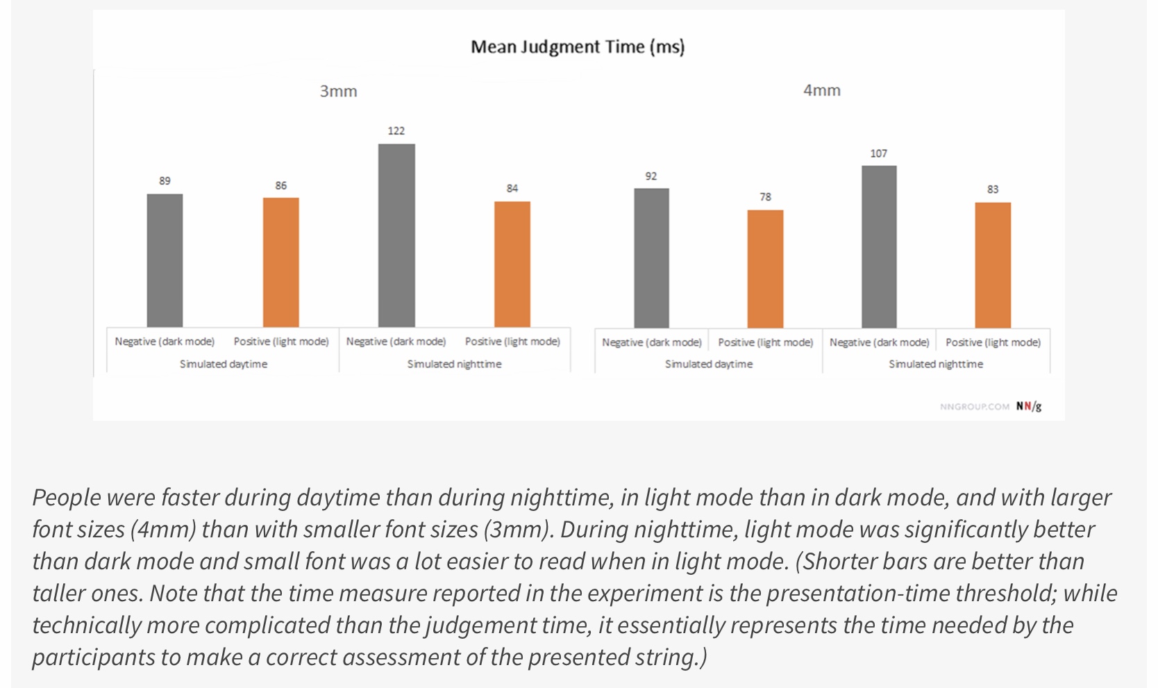
In a compelling study by Jonathon Dobres and his team, they aimed to uncover how factors like time of day and screen lighting influence judgment speed. Their results revealed that these elements, along with text size, play crucial roles. Users exposed to light screens demonstrated faster judgment times. Furthermore, reading larger fonts during the day significantly improved this speed. For instance, users required just 78 milliseconds to form perceptions with a 4mm font in daylight, whereas darker backgrounds extended this time to 92 milliseconds. Embrace light mode for a more efficient reading experience!
Learn more-
Everything You Need to Know About IoT and User Experience
Hick’s Law: Reducing Choices For Interface Design
Raluca Budiu
For nighttime use, lighter user interfaces show significant advantages over darker ones. Light interfaces result in faster judgment times and help reduce eye strain.
New products can effectively convey their messages and value propositions without difficulty. However, an excess of text can complicate the achievement of an optimal visual hierarchy for any product. Established products have a real opportunity to enhance their user interfaces, especially when they contain considerable text. Making these improvements can help reduce negative reviews.
Learn more-
Top 20 Marketing Tools To Attract Customers
UX Strategy: A Product Manager’s Guide to Driving Revenue Growth
Reduces Eye Strain
Pete Woodhouse
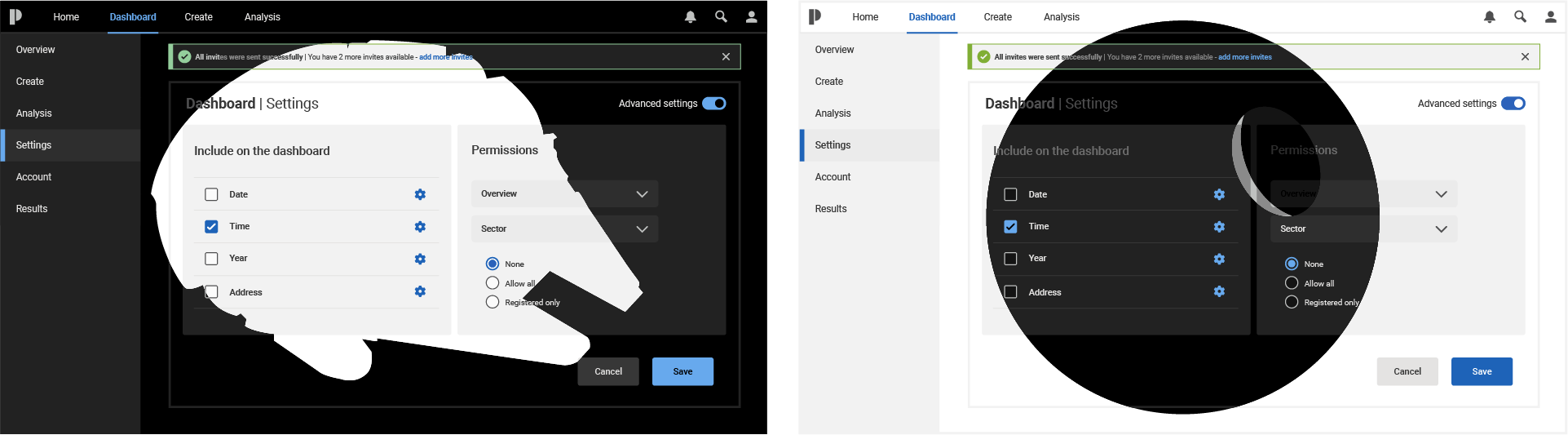
Dark mode enhances text readability by increasing opacity, making it ideal for users who seek comfort during long reading sessions. In contrast, light mode reduces text opacity to 56 percent, effectively minimizing eye strain for many. It’s important to acknowledge that bright light can hinder reading for individuals with specific visual challenges. By carefully balancing color options, we can create an accessible experience that benefits everyone, ensuring that everyone can enjoy reading without discomfort.
New products can utilize usability testing to gather feedback on their design and functionality. This process is essential for product development and ensuring the text is legible. Existing products may use high opacity for text, which can hinder readability. Reducing the opacity can help improve reading comprehension. Adjusting all text to 56% opacity for mature products can enhance overall performance.
Learn more-
Everything You Need to Know About HoloLens- Microsoft’s MR
Hick’s Law: Reducing Choices For Interface Design
Improves Concentration With White Space
MacRumors
As mentioned in a previous blog, How Can White Space Enhance The Product User Experience?
It enhances focus and separates everything individually, making digesting information much more effortless.
According to Dmitry Fadeyev, incorporating text into the design can enhance focus by 20%. This approach allows users to navigate interfaces more easily, resulting in a more organized visual design.
New products can enhance concentration when working with prototypes and high-fidelity wireframes. Usability testing can be used to assess the results. Furthermore, collaboration among team members will become more seamless.
Existing products can improve by adjusting the background to enhance the user experience, while mature products can refine their priorities through necessary revisions.
Employees Want An UI That’s Easy To Read

Shutterstock
Employees must understand a product before using it. This means they should be able to read the information clearly and easily. Employees who interact with customers have a direct impact on revenue. User-friendliness, in this context, refers to ease of navigation and accessibility for those with eyesight difficulties.
Using light mode can address these issues. Reducing the opacity of text helps alleviate eye strain, while increased white space can enhance focus. This will make navigation more straightforward. Improving employee performance ultimately enhances the customer experience.
With light mode, team members can collaborate and communicate comfortably with stakeholders. The product should be legible so that everyone is on the same page. It’s essential to minimize factors that cause headaches and eye strain.
Read more-
User Interface vs. User Experience.
UX Research and Market Research: Know The Difference
Light Mode Can Affect Budgets

Shutterstock
The light mode is easy to implement, and any UX tool can help with it. However, if not used correctly, it can adversely affect a business’s ROI.
Product managers who neglect to use light mode may adversely affect their results, as well as their customers’ and users’ experiences. According to a study by Ipsos and Medallia, 64% of users stop using a product, switch to another, or decrease their usage after having just one negative experience. Not implementing light mode could lead to a poor user experience.
Light mode enhances text legibility, makes it easier to navigate, and reduces eye strain. Accessibility is a crucial aspect of user experience; users who find an app difficult to use will likely turn to competitors. Collaborating with the right design agency can help address these challenges. Read more about Choosing the Right Agency
Conclusion
Deciding between light and dark modes for your company’s product experience can be tough. We’re here to help! For tailored solutions in application design and development, reach out to Designial. Contact us today to take the next step!
Editor’s note: This post was originally published in February 2021 and has been updated for comprehensiveness.