The emotional design UX strategy is one of the best strategies successful companies leverage to stand apart from their competition- think Apple.
With the advent of cloud technology platforms like AWS by Amazon, GCP by Google, or Azure by Microsoft, the infrastructure is a leveled play-field for every company, even startups, and SMBs. They can launch new apps or scale them up rather easily compared to how it was a decade or two ago. So what differentiates one company from the other? How do you stand out in the crowd?
Emotional design is about understanding your customer so well that your product solves a specific problem for them and exceeds their expectations.
New and early-stage products
Like Natalie Massenet said, "Never forget that you only have one opportunity to make a first impression - with investors, with customers, with PR, and with marketing." The biggest question for the product manager of a new product is, what is the first step for getting my customers into the door? For example, how do I solve hurdles for them to start using the product immediately without going through the convoluted sign-up process that every other application puts them through? Users dread signing up with new apps and remembering another username and password. There is a negative emotion associated with the whole sign-up process.
Mature products
Emotional design is also a UX strategy when losing customers to the competition. You can understand behavior based on analytics when you have an existing customer base. You can also ask them directly using qualitative user research methods. What are the positive or negative emotions associated with your app? What do they like about your competition? Analyzing that might provide a solution to retain those customers. Think about the launch of the iPhone SE.
Growth stage products
When app growth has fallen flat, the product becomes stagnant in acquiring new customers or revenues. Product managers can think about engaging with customers emotionally and aligning that with business strategy to achieve the next level of growth. Growth experimentation can target specific pain points of existing customers. It can also be a new product or service that can bring new customers that were not your target customers. Think about the launch of AWS as a platform service.
The aesthetic usability effect
Visual design is an essential part of UX design, so designing something visually pleasing, demonstrating compelling storytelling for content, and using color psychology for branding is the right step toward connecting with customers at an emotional level.
Let's take the example of Netflix, for instance. Over time, Netflix implemented many elements into its user experience that exhibited emotional design. The interface provides more personalized options for users, gives users the ability to create customizable playlists, uses color psychology to promote certain emotions and for branding, and reduces excessive amounts of components for users for ease of navigation. All these changes in Netflix have improved user experience and developed a positive emotional connection with its customers.
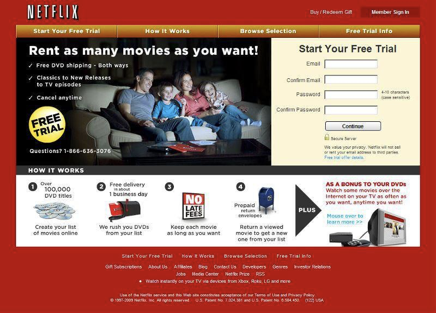
Before
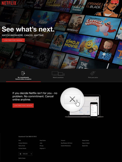
After
Functional and attractive elements aesthetically drive more interest and engagement for customers. The aesthetic-usability affect- people perceive visually pleasing designs as more comfortable. Apps with minor usability issues are more likely to be forgiven if they demonstrate aesthetic qualities and attractive features that work well.
How does the user interface's aesthetics relate to solving business problems and addressing customers' pain points? For example, reducing support calls is one of the primary problems faced by many businesses. Clearer visuals that use the right color choices and contrast to promote an excellent visual hierarchy and reduce support calls.
The psychology of design
According to The Psychology of Design, two Japanese ATM Machines were used for a test to see what users would choose. Both were identical in function but used different interfaces. One ATM was bland and had a bland interface setup focused on simplicity. The other ATM used a visually engaging user interface and visuals. Studies showed that customers preferred the aesthetically superior ATM. It was the most used product, and the users considered as easy to use.
Your customers' brains work overtime to process information that is not easy to understand. Users don't want to increase their cognitive load while navigating complex navigation systems. Analyzing what is on the screen and remembering navigation slows down their thinking. Leveraging emotional design principles removes this pain point by offering users rich, understandable content with body copy that triggers positive emotion.
The power of engaging content
Compelling storytelling for content creates an engaging experience for the users of business apps. Business apps often don't have loads of content. However, contextual messages that are helpful where customers might get stuck, using consistent terminology across a product or entire product suite, menus/navigation elements need to align with users' mental models.
For new products, you can leverage the card-sorting user research method to find the right terms for exciting products and feedback from existing users.
You can use user research to validate content with existing customers periodically to maintain relevance.
For stagnant products, you can leverage user testing using multivariate testing (more variations than A/B testing).
An example of a case study that improved with emotional design to solve business problems and satisfy users' pain points is from Virgin America.
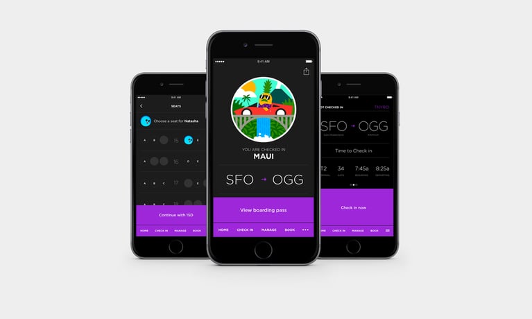
Source: Virgin America
Virgin America is the number one featured app on both Apple and Google Play. What's their secret? They redesigned existing applications and maintained that excellent UX strategy across all products and services. Their product redesign addressed some of the following-
- Slashing the promotional messaging most airline sites feature prominently on the homepage.
- Created an architecture to provide the flexibility we needed for iOS and Android
- Included lightweight, colorful illustrations and personalized user avatars
- Used engaging interstitial messages throughout the applications
- Include perks like touch-screen entertainment
Energetic visuals that use color psychology are useful for directing users to make confident choices. It helps users understand what one's business and product represent.
For instance, red speaks aggression and energy, while yellow speaks optimism and happiness. Black and white coloring both indicate power and elegance. Using specific coloring can help build a better connection with users with the right emotion depending on one's brand image and mission statement for a business.
Three levels of emotional design
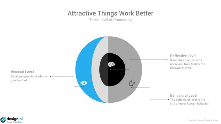
According to Don Norman, the emotional design consists of three levels: Visceral, Behavioral, and Reflective.
The visceral level focuses on the first impression of a product or user interface (UI). The visceral level is useful for attracting customers for new products entering the market for startup founders.
The behavioral level focuses on how a product satisfies users' needs and requirements. Emotional connection at the behavioral level is critical to retain customers.
The reflective level evaluates the behavioral level to identify opportunities. At this stage, product managers can build experimentation methods to evaluate the current product to identify and implement growth strategies.
Customer-facing and employee-facing apps
Employee-facing products have many challenges in terms of achieving business goals, at the same time, helping employee address their pain points. For example, reducing the time on task by providing the right information in the right context can benefit from emotional design. Using predictive visual patterns for similar tasks saves time reading and analyzing the information and jumps directly to decision CTAs.
Companies leverage an emotional design strategy that uses brand-colored options to promote brand values and tie them to the decision-making process. For example, Apple uses brand colors for its website, and Google uses brand colors for all apps. UI helps customers understand the brand's image: power and elegance. They use brand colors for CTAs, navigation menus, and more so customers know their applications belong to the same family of apps.
The effect of a downturn
In a recent survey, usertesting.com, a UX research SaaS company, found that consumers are in a very different emotional state. It is easy to offend your customers, so companies should test messaging carefully.
Startups and SMBs face hard times in a downturn and are affected more than larger companies. It is a challenging time for their customers, as well. It is even more critical to connect with your customers at an emotional level to show empathy, compassion, and supportiveness. For example, does your business use relevant terms to the current pandemic, such as touchless delivery or curbside pickup?
During downturns, companies and their customers are sensitive to pricing. Everyone wants to get more done with less. Businesses can find opportunities to automate repetitive processes, leveraging cutting-edge technologies such as artificial intelligence. Perhaps, pass those savings on to their customers.
When you want to restrain spending, pricing such as fixed pricing based on the outcome instead of output can assist in lowering costs and setting limits for managing app UX design.
In conclusion
If you would like to leverage the emotional UX design strategy for your products, we can help. Book a free consultation with us.
Editor's note: This post was originally published in December 2020 and has been updated for comprehensiveness.